Why showing raw data matters

Bar and line graphs with standard deviation (SD) or standard error (SE) error bars are often used to visually present continuous data from laboratory studies with small sample sizes. Last year the journal PloS Biology published a paper showing that presenting such data this way is problematic for the following reasons:
- bar and line graphs conceal how data are distributed
- summarising small datasets with mean and SD or SE error bars conceals outliers and forces readers to assume data are normally distributed
- paired or non-independent data cannot be accurately visualised with bar and line graphs
Figure 1 below, reproduced from the paper, demonstrates some of these reasons. Data points from four groups of participants are presented in bar graphs showing mean ± SE (panel A), or mean ± SD (panel B), or in a scatterplot (panel C). Panel A seems to show that participants in group 2 have higher data values compared to participants in other groups, however SD’s in panel B show there is considerable overlap in data values between groups. That is, presenting SE error bars magnifies an apparent visual difference between groups, but SE’s measure variation of the mean, not variation of the sample data. In contrast, a scatterplot of the raw data (panel C) clearly shows sample sizes are small with group 2 have the smallest sample size, there is substantial variability of the data in group 1, and group 3 has an outlier. None of these characteristics are evident in the bar graphs in panels A and B.
Figure 1:
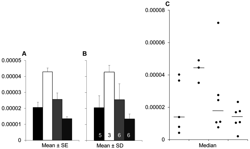
Showing raw data (e.g. with a scatterplot) is needed so readers may critically assess the authors’ interpretation and conclusions of the data, and opens the findings to robust discussion. Showing raw data is important whether sample size is large (such as data used in the recent correlation analysis post) or small; inspection of raw data is probably even more important when sample size is small.
Reference
Weissgerber TL, Milic NM, Winham SJ, Garovic VD (2015) Beyond Bar and Line Graphs: Time for a New Data Presentation Paradigm. PLoS Biol 13(4): e1002128.
