The smoke and mirrors of plotting summary statistics

Every scientist has, at one point or another in their career, plotted results using bar graphs or dot plots with error bars. As pointed in a previous post, these kinds of summary graphs can be misleading, especially since a depressingly large number of scientists plot their error bars as the standard error of the mean (SEM) rather than the standard deviation (SD) or, when appropriate, the 95% confidence interval. As pointed out in that same post, a key problem with summary graphs is that they conceal the nature of the underlying data. Thus, scientists are increasingly encouraged to plot the data used to compute the summary statistics in summary graphs (e.g., Drummond & Vowler, 2011).
Plotting and interpreting results from experiments with repeated-measures
A plot of summary statistics calculated from related data points will reflect the average behaviour across subjects (or samples). However, when a plot reveals a pattern over time, humans may erroneously conclude, consciously or not, that each subject or sample used to compute these summary statistics follow the same overall pattern.
The figure below shows results where 10 subjects received an intervention at time point zero, and measures (presented in arbitrary units) were taken for 13 minutes after the intervention.
Figure 1:
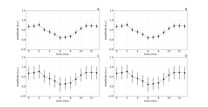
Notice that the mean value at each time point is the same for each subplot. Also, the error bars on figures A and B are the same, and those on figures C and D are also the same. Imagine yourself coming across figures A and C in a scientific paper, what question would you ask yourself? What would be your best guess at what the underlying data looks like? What would be your best guess at the measure of variance used in the figures?
SEM vs SD.
The reason the error bars are smaller in figures A and B is because they are SEMs. The SEM corresponds to the SD divided by the square-root of the sample size, so with a sample size of 10 the SEM will be roughly 3 times smaller than the SD. As you might expect, the error bars in figures C and D correspond to SDs. An alarming number of scientists erroneously report SEMs, either because that is what they were taught to do, or because they are well aware that SEMs are much smaller than SDs, and thus make the data appear to be less variable.
Figure 2:
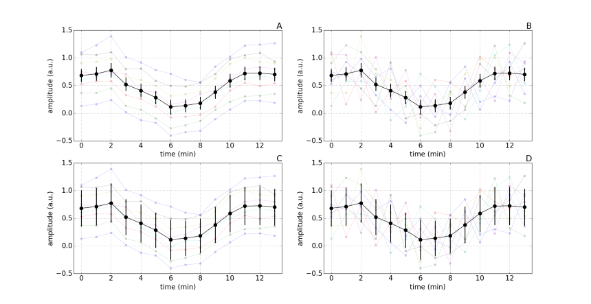
Plotting individual sample data.
By also plotting the data from each of the 10 subjects, it is clear that figures A and C are from one experiment and figure B and D are from another. But remember, the mean values at each time point are the same for all figures, and the error bars are identical in figures A and B, as well as figures C and D. Consequently, plotting only summary mean and error bars, without plotting the individual data, masks the underlying patterns in the data.
Let’s assume that the authors reported that there was a main effect of time and that the intervention led to a significant reduction in response amplitude at some of the time points. Would you interpret the results of figure C and D any differently? What additional information does plotting individual subject data provide? Which outcome measure do you think is more reliable, the measure reported in experiment A or the measure reported in experiment B? Which type of error bar best represents the underlying data?
Summary
Reporting results visually can be a highly effective way of transmitting lots of rich and informative details. However, the opposite is also true: reporting results visually can be a highly effective way of transmitting a small amount of uninformative generalities. Readers, reviewers and editors should hold authors of scientific papers to a higher standard.
Let the data tell the story, rather than have the authors spin it for us.
References
Drummond GB, Vowler SL (2011). Show the data, don’t conceal them. J Physiol 589:1861-3.

In my experience, presenting the standard deviation when the standard error in the mean is appropriate is the much more common error. If the goal is to estimate a quantity by measuring the mean of that quantity over a sample, the standard error in the mean is the correct error bar. If you are interested in the variation over the sample, then the standard deviation is an appropriate measure. For example, suppose you were interested in the typical BMI (body mass index, a measure of obesity) of UK males. You could get a sample of UK males, hopefully an unbiased sample, and average their BMIs. An appropriate quantity to express the uncertainty in the average BMIs is the standard error in the mean. The standard deviation estimates the amount of variation in BMIs in the UK population, but it is not an error bar.
-Jonathan
LikeLike
Thanks for you comment Jonathan, you are spot on.
The standard error of the mean is chronically misused in neuroscience publications. Some papers will state that they use standard error of the mean in figures and standard deviation in text; clearly this highlights a misunderstanding of these statistics and what they quantify. Other will report the standard error of the mean throughout their manuscript, regardless of whether the goal is to describe (e.g. reporting the age of samples subjects) or to make inferences (e.g. drug A cause a mean increase of X beats per minute).
While the standard error of the mean does express the uncertain associated with our estimate of the population mean determined from a sample, there has been a fairly strong push to report the 95% CI (e.g. 1, 2). This range, which is based on our selected level of alpha, can more easily be used to interpret results and make inferences. On the other hand, the standard error of the mean corresponds to a 68% CI, which is not as simply to interpret. Unfortunately, even the use and interpretation of the 95% is problematic, as highlighted in this blog post by Tom Siegfried (3).
Overall, it seems we still have a ways to go in terms of statistical literacy…
Thanks for taking the time to write.
-Martin
T. A. Lang and D.G. Altman. Basic Statistical Reporting for Articles Published in Biomedical Journals: The “Statistical Analyses and Methods in the Published Literature” or The SAMPL Guidelines” in: Smart P, Maisonneuve H, Polderman A (eds). Science Editors’ Handbook, European Association of Science Editors, 2013.
Curran-Everett D, Benos DJ (2004). Guidelines for reporting statistics in journals published by the American Physiological Society. Adv Physiol Educ. 2004 Dec;28(1-4):85-7.
https://www.sciencenews.org/blog/context/scientists%E2%80%99-grasp-confidence-intervals-doesn%E2%80%99t-inspire-confidence
LikeLike
I just stumbled across your web site. Nice work!
I’ve added a link to your site in the relevant section of my own web site, at the end of the list of papers, articles & other resources on the topic of good vs. bad science:
http://www.sealevel.info/papers.html#whitherscience
LikeLike
Hi Dave,
Thank you for including us on your prestigious list. It is nice to hear that others feel the same way about sound science!
Marty
LikeLike