Generalised linear models, part 1: Link functions

Linear models are an ideal method to analyse continuous outcomes, those that can take an infinite number of values between any two values, such as age and blood pressure. However, it can be problematic to use linear models to analyse categorical outcomes, those that can only take fixed values, such as "yes/no" survey responses, or "event/non-event" of disease. This is because linear models assume that outcomes are continuous, but categorical outcomes take 2 (or more) fixed values.
Instead, categorical outcomes can be expressed as probabilities. For example, if 2 in every 1000 people are diagnosed with a disease (i.e. some experience the disease event, but not others), we say that the probability or risk of disease is 0.002. Using linear models to analyse probabilities sounds better because probabilities vary infinitely between 0 and 1. But probability values have boundaries at 0 and 1: they can’t be less than 0 or exceed 1. It turns out that using linear models to analyse outcomes that have boundaries, such as probabilities, is also problematic. Why is this so?
Understanding events and exposures
Many research questions investigate how exposures change events, and we need appropriate methods to analyse/model these changes. Let’s use a toy example to illustrate this. Suppose I like ice cream, and we want to know how sunniness affects my ice cream consumption. For a given 7-day week, we could table the number of days that I eat or don’t eat ice cream, if it is sunny or not sunny, like this:
| Sunny | Not sunny | |
|---|---|---|
| Ice cream | 2 | 1 |
| No ice cream | 5 | 6 |
Table 1. How sunniness (exposure) affects ice cream consumption (event). Counts in each cell indicate number of days in a given 7-day week.
We can think of eating ice cream as an event which takes place depending on sunniness. If I’m exposed to sunny days, I eat ice cream twice as often than when it is not sunny. So we think of sunniness as the exposure. (PS. I do like ice cream, but not enough to eat ice cream twice a week every week!)
Since the event either happens or does not happen, it is binary or dichotomous categorical. We are interested in whether being exposed (sunniness) changes the number of events (eating ice cream) compared to not being exposed. How should we determine this?
Analysing events and exposures
One old approach might be to perform a chi-square test of statistical significance or similar to compare the number of events between exposures. But this test doesn’t really answer the question, and is sensitive to sample size and low numbers of events. So it is not desirable.
Another approach is to determine if the probability of events is greater when exposed compared to not exposed. As above, using probability as an outcome is better because probability can take an infinite number of values between 0 and 1 for any given exposure; the probability of an event behaves more like a continuous variable. But fitting a linear model is problematic because it easily predicts impossible probabilities for a given change in a predictor:

Fig 1. A linear model of probability mass (solid blue line) increases at a constant rate for a given increase in predictor x, even beyond the maximum limit of probability = 1 (dashed blue line). This is not possible in real life.
What we need is a way to convert probability outcomes (of events) into a new variable that allows us to model exposures using linear combinations, without violating the boundaries of probability at 0 and 1. This way, we can apply a linear model to analyse how a predictor changes the new outcome, then back-convert results in units of the new outcome to return to original probability.
Link functions in generalised linear models
This is what a link function does. A link function is a mathematical function that converts a model’s outcome into a new variable that is connected/linked to its predictors in a linear way:
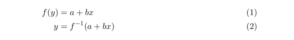
where,
is the link function, and
is its inverse
is the outcome
is known as the linear predictor
Because a link function connects a model outcome to linear combinations of predictor(s), it generalises linear models, allowing linear regression of outcomes from distributions other than the Normal distribution. Generalised linear models allow us to analyse data without violating boundaries in real life. We need to do this because statistical models are agnostic to real world boundaries; they just do as they’re told, but predictions can be nonsense (McElreath 2020, Chp 1).
The inverse of a link function then back-converts the linear combination of predictors into the original outcome.
There are lots of link functions: common ones include the logit, log, and probit. Generalised linear models are applied in both frequentist and Bayesian approaches. Using generalised linear models is similar to but not exactly the same as transforming data — this post by The Analysis Factor explains why.
An illustration using the logit link
Recall that odds and probabilities are related like so:


The logit link is defined as the log of the odds. That is 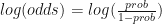

Fig 2. The logit link (through its inverse, the logistic) converts a linear model of the log-odds of an event (left) into a probability of the event (right). The conversion is done such that for a unit change in predictor x, the change in log-odds is constant (left), but the change in non-linear probability is less and less as probability approaches 1 (right). This figure partially replicates Fig 10.7 in McElreath 2020, p 317. Horizontal probability gridlines on the right are calculated from log-odds gridlines values on the left. Python code to generate the figure is shown at the end of the post.
In the ice cream example above, we are interested in whether being exposed (to sunniness, like being exposed to the predictor x) changes the number of events (of eating ice cream, the outcome in log-odds or probability units) compared to not being exposed. If we had data on ice cream consumption and sunniness from a group of people, we could (1) convert the probabilities of eating ice cream when sunny or not sunny into log-odds; this is equivalent to getting the logits, (2) do linear regression of the log-odds of eating ice cream on sunniness to get the slope, and (3) back-convert the slope in log-odds units to units of probability. Cool, huh!
In the next post, we will see the math behind this to understand how a logit link works, and why it is nifty!
References
McElreath R (2020) Statistical Rethinking: A Bayesian course with examples in R and Stan (2nd Ed) Florida, USA: Chapman and Hall/CRC, Chp 1 and p 317.
Posts in series
Python code
import numpy as np
import matplotlib.pyplot as plt
from scipy.stats import linregress

x = np.arange(-1, 1, 0.1)

# simulate the log-odds (ie. the logits) of an event
log_odds = np.arange(-2, 2, 0.2)
slope, intercept, rvalue, pvalue, se = linregress(x, log_odds)

# convert log-odds to odds using exponentiation,
# then convert odds into probability: prob = odds / (1 + odds)
prob = [np.exp(intercept + slope * i) / (1 + np.exp(intercept + slope * i)) for i in log_odds]

# plot
fig, axes = plt.subplots(figsize=(6, 4))
ax1 = plt.subplot(1, 2, 1)
ax1.plot(x, log_odds, 'k')
axes = plt.gca()
axes.yaxis.grid()
ax1.set_xlabel('x')
ax1.set_ylabel('log-odds')
plt.xlim(-2, 2)
plt.ylim(-2.2, 2.2)

ax2 = plt.subplot(1, 2, 2)
ax2.plot(x, prob, 'k')
log_odds_grids = [-2, -1.5, -1, -0.5, 0, 0.5, 1, 1.5, 2]
prob_grids = [np.exp(intercept + slope * i) / (1 + np.exp(intercept + slope * i)) for i in log_odds_grids]
prob_grids = np.around(prob_grids, decimals=2)
ax2.set_yticks(prob_grids, minor=False)
ax2.yaxis.grid(True, which='major')
ax2.set_xlabel('x')
ax2.set_ylabel('probability')
plt.xlim(-1.2, 1.2)
plt.ylim(0, 1)

plt.tight_layout()
plt.savefig('fig-1.png', dpi=300)
plt.close()
