Research concepts: The Normal Distribution

At Scientifically Sound, we have shown how to verify whether data are Normally distributed, and discussed whether it matters that data are Normally distributed. Let’s take a step back and consider what a Normal distribution is.
A Normal distribution is a bell-shaped curve observed when the number of data points that occur in a population (y-axis) is plotted against the data points themselves (x-axis). This kind of plot is a histogram. Alternatively, we may also observe a bell-shaped curve when the probability of the data is plotted against the data points in a probability density plot.
Here’s an example of some simulated data from a previous statistics note. This figure shows the probability density plot and a smoothed fit of Normally distributed data:
Figure 1:

In a Normal distribution, we see that most of the data are found close to the mean (i.e. the “average” value) where the bell is most pointy in the middle. But as data points get larger or smaller away from the mean, the amount tapers off so that few data are found at the left and right tails of the distribution. Consequently, the Normal distribution is symmetrical about the mean.
Why are these data distributed this way? A Normal distribution arises when many random factors create variability in the data. For example, our previous post showed variability between people in their body temperatures. This variability could be caused by different physiology between people, ambient temperature, small fluctuations in recorded temperatures, etc. The key point is that random variation causes the data to be distributed in a bell shape. In contrast, systematic deviation, where data points are consistently pushed higher or lower, would instead produce a distribution of the data that is skewed to one side.
In the previous post, we learned how to calculate the standard deviation (SD) to quantify scatter of continuous data. How is the SD relevant to the Normal distribution? The SD is a measure of the spread of data in the distribution. We could quantify how much data lie within units of SDs from the mean. The following figures plot the probability density function of the data, and shades the area under the curve within units of SDs from the mean:
Figure 2:
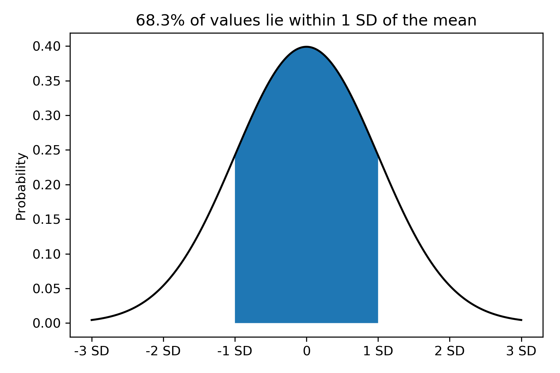
Figure 3:
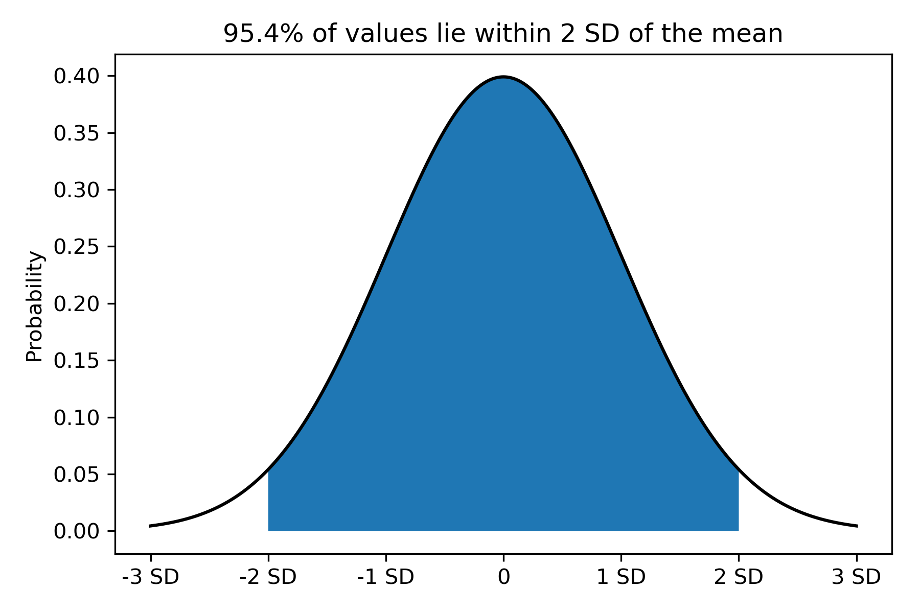
In Figure 2, we see that about two-thirds of the data (68%) lie within 1 SD to the left and right of the mean. In Figure 3, about 95% of the data lie within 2 SDs to the left and right of the mean. That is, we “capture” most of the data in the whole Normal distribution in the region bounded by 2 SDs to the left and to the right of the mean.
The Normal distribution is important because many statistical methods assume that data follow a Normal distribution. Specifically, they assume that the population is Normally distributed, and a sample of data drawn from the population (when sampled correctly) contain data that are also Normally distributed. In addition, statistics such as means and proportions can themselves be Normally distributed!
One final neat thing is that mathematically, we can completely describe a Normal distribution using just 2 parameters: the mean and the standard deviation.
Summary
A Normal distribution is a bell-shaped curve where most data lie close to the mean, and few data lie far from the mean. The SD quantifies the spread of data in the Normal distribution. Most data points (~95% of the data) lie within 2 SDs to the left and to the right of the mean. The Normal distribution is completely described by 2 parameters: the mean and SD.
Lastly, we will learn how to calculate the 95% CI about a mean.
Reference
Motulsky H (2018) Intuitive Biostatistics. A Nonmathematical Guide to Statistical Thinking. 4th Ed. Oxford University Press: Oxford, UK.
