Badly behaved data, part 1: Create and plot the data

Most of us have to deal with badly behaved data at some point. Data are not always Normally distributed, even by any stretch of the imagination. And pesky outliers cause many good scientists bad headaches. In this series we’re going to explore some approaches to deal with these problems. Each approach has its pros and cons, and there is no silver bullet. But understanding the principles and mechanics might help you decide which approach is preferable the next time you encounter badly behaved data.
The first (and most useful!) step before running any statistics is to plot the data. This is important even when you have planned your statistical analysis ahead of time. As an investigator, you want to see the pattern of how individual data values are spread out because this can influence the kind of statistics needed.
Let’s create the following data:
- Draw 98 random values of human heights from a Normal distribution (of mean = 168 cm, standard deviation = 20 cm). To these, add heights from 2 very tall people.
- Draw 100 random values of days to discharge from hospital from a log-Normal distribution.
- For each of these variables, plot (a) histograms of the data and (b) consecutive individual values connected by lines. Save the figure.
- Store the created data in a Pandas dataframe and export it to CSV.
The Python code to execute these steps is shown at the end of this post. Running the code generates this figure:
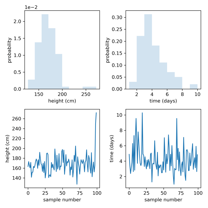
Fig 1. Histograms (top row) and trace plots (consecutive individual values connected by lines, bottom row) of simulated heights (left column) and days to discharge (right column).
What a busy figure! Let’s backtrack a bit to understand what is going on in those steps and in the figure.
Probability distributions: things where data come from
The word probability used to scare me. I mean, we don’t see a probability the way we see our computer monitor. But probability is just some number of things divided by another number of things. So probability really just involves adding (i.e. counting) and dividing. A probability distribution shows the spread of these counts relative to other counts. And we talk about probability distributions of random variables when some number (the variable) can vary or take different values for e.g. different persons.
A Normal or Gaussian distribution is a bell-shaped probability distribution of a random variable. It is a common type of distribution in nature, and is described by only 2 parameters: a mean (average) and standard deviation (variability). Why did we draw human heights from a Normal distribution of mean 168 cm, SD 20 cm? Well, because yours truly is 168 cm tall, I guess I am about average height, so it seemed reasonable to centre the distribution about my own height. The standard deviation shows how much the data vary (or spread out) around the mean.
A log-Normal distribution is a probability distribution of a random variable whose logarithm is Normally distributed. E.g. if 

Ways to visualise data
One way to visualise how data are distributed is to vertically stack identical or similar data values in bins (groups of values) where the height of each bin is the number of data values in that bin. This produces a histogram of counts of data values. The height of each bin could also be shown as the number of data values in the bin divided by the total number of data values. This produces a histogram of probabilities of data values, where the height of each bin shows how probable the data in that bin are. This is also known as the probability density. The probabilities from all the bins add up to 1.
The panels in the top row of Fig 1 were obtained in this way. Random values of height and days were drawn from Normal and log-Normal distributions using rvs (random variates) for each distribution, and histograms of the data were plotted to show the probability density. We see that heights are Normally distributed, but there are two outlier individuals who are extremely tall (top left). Because the bin probabilities are small, they are reported in scientific notation e.g. 2.0 x 1e-2 = 0.02. On the other hand, days to discharge is skewed, with a longer tail to the right (top right). Most people are discharged within a few days, but some people only leave hospital much later.
The panels in the bottom row of Fig 1 help us visualise the data differently: consecutive data values are plotted against their sample number and connected by lines. One could say that we traced lines between individual data values. If height data were correctly sampled from a Normal distribution, we should expect the values to scatter roughly about the mean (168 cm), which they do (bottom left). Remember that we added 2 extremely tall heights to give us our outliers. Likewise, days to discharge are always positive (bottom right).
Summary
We simulated Normal and non-Normal data, and visualised the individual data values in histograms and trace plots. Normal distributions are common in nature. Log-Normal distributions are a useful way to constrain a variable to take only positive values.
Having visualised the data, we now have a better idea of how the individual data values are distributed. It is clear that height data have outliers, and days to discharge data are right skewed. In the next post, we will see how we might deal with these problems.
Posts in series
- Handling badly behaved data 1: create and plot data
- Handling badly behaved data 2: log-transform one sample
- Handling badly behaved data 3: log-transform to compare 2 means
- Handling badly behaved data 4: robust regression for outlying data
Python code
import numpy as np
import matplotlib.pyplot as plt
from scipy.stats import norm, lognorm
import pandas as pd

np.random.seed(15)

# generate height data: sample from Normal distribution
mean, sd = 168, 15
heights = norm.rvs(loc=mean, scale=sd, size=98)
heights = np.append(heights, [250, 272])

# generate days to discharge data: sample from log-Normal distribution
shape = 0.4
scale = 4
days = lognorm.rvs(s=shape, scale=scale, size=100)

# plot
fig = plt.subplots(figsize=(6, 6))
ax1 = plt.subplot(2, 2, 1)
ax1.hist(heights, density=True, histtype='stepfilled', alpha=0.2)
plt.ticklabel_format(axis='y', style='sci', scilimits=(0, 0))
ax1.set_xlabel('height (cm)')
ax1.set_ylabel('probability')

ax2 = plt.subplot(2, 2, 2)
ax2.hist(days, bins=np.arange(min(days), max(days), 1),
         density=True, histtype='stepfilled', alpha=0.2)
ax2.set_xlabel('time (days)')
ax2.set_ylabel('probability')

ax3 = plt.subplot(2, 2, 3)
ax3.plot(heights)
ax3.set_xlabel('sample number')
ax3.set_ylabel('height (cm)')

ax4 = plt.subplot(2, 2, 4)
ax4.plot(days)
ax4.set_xlabel('sample number')
ax4.set_ylabel('time (days)')

plt.tight_layout()
plt.savefig('figure.png', dpi=300)
plt.close()

# save data to CSV
df = pd.DataFrame({'heights': heights, 'days': days})
df.to_csv('data.csv')
